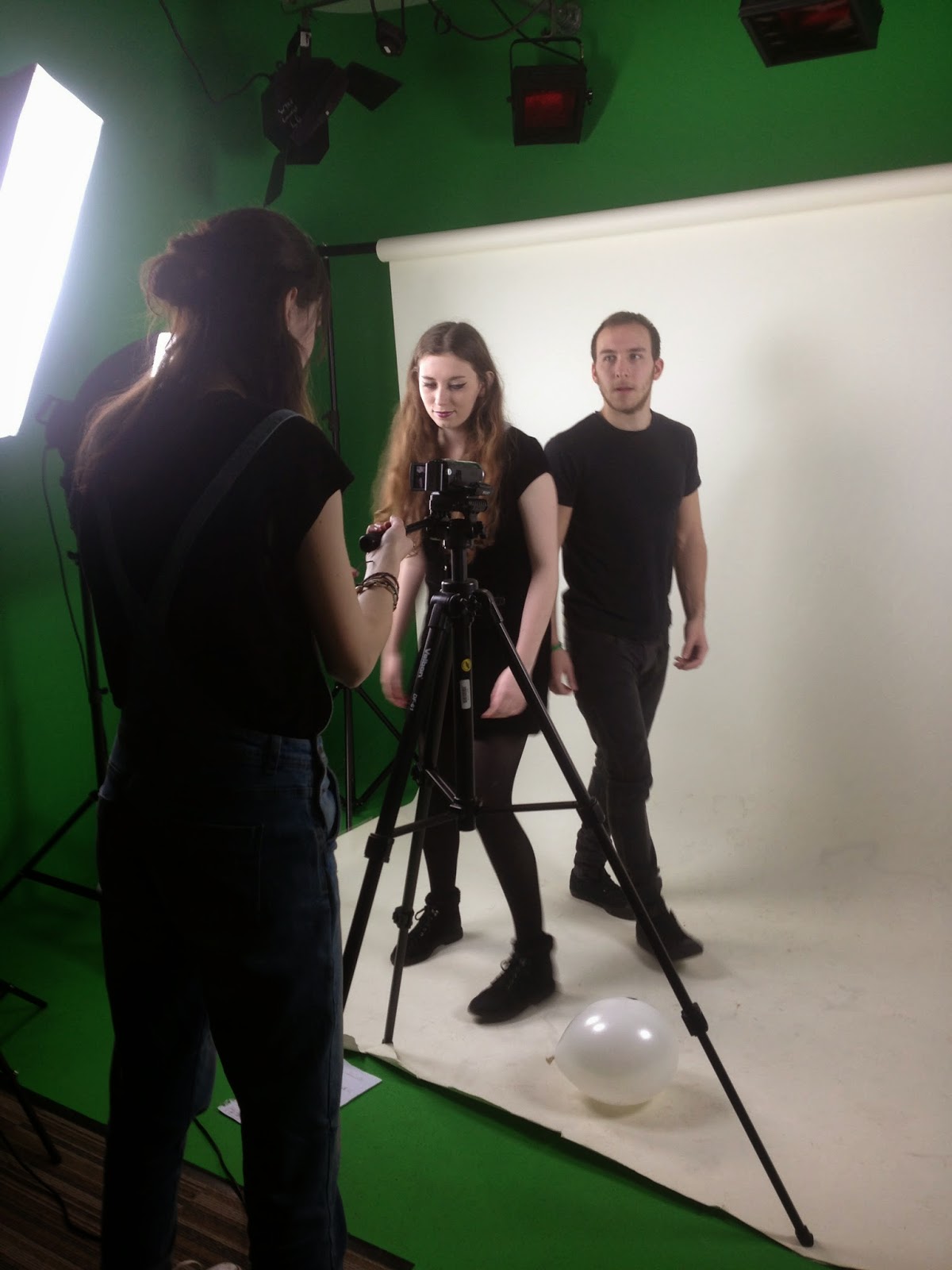
Tuesday 7 April 2015

Final Products/Promotional Package

Music Video (main product)


Magazine Advert (ancillary text)

Digipak (ancillary text)


Evaluation (Introduction)

After completing the research & planning stage of my A2 Media Studies coursework (Advanced Portfolio), and completing the three required final pieces (music video, digipak and magazine advert), I am required to carry out a formal evaluation of my work and the processes I went through when completing it. The questions I am required to answer are:

  1. In what ways does your media product use, develop or challenge forms and conventions of real media products?
  2. How effective is the combination of your main product and ancillary texts?
  3. What have you learned from your audience feedback?
  4. How did you use media technologies in the construction, research, planning and evaluation stages?
I will be answering these questions using various media platforms.

Monday 6 April 2015

Evaluation Question One: In what ways does your media product use, develop or challenge forms and conventions of real media products?


Above are some slides I put together briefly reflecting on the the conventions I followed and features I used within my promotional package and how they link to existing products from within the indie genre.
Below are 3 videos I put together of myself explaining in detail how I used the conventions I have identified above (both following, developing and challenging them), why I made the creative decisions I made, and the effect I wanted them to give to the audience.


This is a further textual analysis of my main product (music video) in relation to the conventions I used, developed and challenged, and the reasons why I made these creative choices:

Evaluation Question Two: How effective is the combination of your main product and ancillary texts?


Fonts:
I wanted the main fonts on my ancillary texts to be cohesive with my main product so they all combined effectively. I used two fonts on my ancillary texts: Yo Lobi and Arsenale White (both from dafont.com). These fonts, I felt, were both bold and aesthetically pleasing, so I knew they would work effectively on my digipak and magazine advert. I also thought these fonts reflected the indie genre and my artist's image well, because they were quite unique and stylish. The reason I used Yo Lobi as the font for the album name 'Foundations', etc. was because it was a brush style font, which linked to my music video as the artist is painting out the title 'Foundations' throughout the video. In this way the fonts looked similar which created cohesion in my promotional package. Arsenale White is a handwritten style font, which I picked because it appeared more personal and original than most traditional fonts. This was the look I wanted for the font of my artist's name 'Juno' as it seemed to give a personal-style touch to the products, as if it was her own unique font or how she actual writes her name. I felt this represented her as having a commitment to her craft (music) and gave her a creative flair, which is typical of an artist of the indie genre.

Colour Scheme:
I created a set colour scheme throughout the promotional package, with pinky-purple, green and yellow being the main colours on my ancillary texts, as well as being the most stand out colours in my main product. I chose these colours after going on color.adobe.com and uploading some of the moodboards I had created during the planning stage of my coursework. This site provided me with lots of different colour scheme ideas, and after experimenting with different colours when making drafts of my ancillary texts, I made my final decision. I felt these colours were bold, eye-catching and combined effectively to make my products look attractive and appealing to audiences. They also reflect the bright, colourful image I wanted to create of my artist in the promotional package, as well reflecting the more specific 'indie pop' genre in the same way. To create continuity of the colour scheme throughout my promotional package, I used specific props, e.g. lemons and coloured balloons, in my music video (main product) which made the colours used on my ancillary texts the most stand out colours in the video too. This continuity was also achieved through my use of the same props (lemons and coloured balloons) as the patterns on the two disc panels of my digipak. In this way, I believe the combination of my products are effective.

Mise-en-scene:
The mise-en-scene I have used helps establish the combination of my products as being effective. Firstly, I used the same props across the promotional package to create cohesion. For example, I use the lemons and coloured balloons as props in my music video, and these also feature as the patterns on the two disc panels on my digipak. Additionally, the artist is seen wearing heart shaped glasses in one scene of my video, so I used them on my ancillary texts too. The main image on both my digipak front cover and magazine advert is a mid shot of the artist wearing the same heart-shaped glasses. I felt this created continuity in my products, which is a crucial factor, as well as establishing the quirky, bright image/representation I wanted to create for the artist, which is also conventional of female artists of the indie genre. I also ensured the artist had the same look in the images on the ancillary texts as she did in the main product. Therefore, I had her wear the same black velvet playsuit for the ancillary text photoshoot, as she wears in multiple scenes of the music video, as well as having her hair down and wavy like she does in the video too. This gave the artist a consistent look and helped give her a set style for audiences to consume. Furthermore, the location of the ancillary photoshoot was in the green room, in which I used the white wall. I did this to make sure the images used on these products had the same look as the majority of scenes in the music video (which were also filmed in the green room), to once again create a cohesive style.

Imagery (cinematography, editing, etc.):
I used conventional style 'imagery' in my products. For example, I used a variety of shot types in my main product, such as close-ups, over-the-shoulder shots, mid-shots, long shots and two shots. The main shot type I used was variations of the close-up (e.g. medium close-up, extreme close-up). I mainly used close-ups during lip-sync scenes due to this being conventional because it keeps the focus of the frame on the artist's lips as she is singing the lyrics. Additionally, because I often used variations of close-ups, I ensured my ancillary texts matched this style, so I took medium close-ups/mid shots for the main image of both my magazine advert and digipak front cover, so there was continuity across my promotional package in this way. In relation to the editing techniques I used, I kept it very simplistic. The main editing transitions I used between scenes were jump cut, wipe and fade, as these felt the most appropriate to use and gave the product a smooth flowing look. I also put overlays on a few scenes, e.g. flash and bloom. This just added a bit of variety to the video without it being too 'in your face' or unnecessary, it also allowed me to show that I do have skills on the editing software (Final Cut Pro). I maintained this simplistic look on my ancillary texts too so there was a cohesive style to the products. For example, I didn't go overboard on the editing of my images on the ancillary texts, I just enhanced and adjusted features such as the brightness, contrast, etc. of the images on Photoshop so they looked more attractive. Therefore, this is how I used imagery to make the combination of my main product and ancillary texts effective.

Genre:
David Chandler (2001) argues that the word 'genre' comes from the French for 'kind' or 'class'. Therefore, genre refers to a distinctive type of text. This relates to my products as I ensured I adhered to the conventions of the indie genre in both my main product and ancillary texts, so my promotional product was part of the distinctive type of the indie genre. For example, I used specific outfits and quirky props to establish my artist as having a unique and colourful style, which is conventional of female artists within the indie genre. My products are also very simplistic, e.g. everyday locations used (such as the park), due to having a low-budget, which is typical of the indie genre because indie artists belong to independent record labels, who do not have the funding of the mainstream 'big 3'. Furthermore, Barry Keith Grant (1995) stated that all genres have sub-genres, which are more specific categories that allow audiences to identify them via familiar and recognisable features. My promotional package relates to this in that my artist is not only of the indie genre, but, more specifically, the indie pop genre. Kate Nash, the original singer of the song 'Foundations', which my music video is set to, is also part of the indie pop genre, so I thought it was appropriate for my artist to identify with this genre too in order for her sound and style to match cohesively. This sub-genre was also a contributing factor when I decided upon the colour scheme for my products, as the use of brighter, more eye catching colours (like the ones I used) is typical of the indie pop genre because of its more upbeat sound and nature, in comparison to indie rock, in which artists would have used more dark simplistic colours.

Theory:
In order for the combination of my main product and ancillary texts to be effective, I inevitably adhered to certain media theory. This means my products link to aspects of narrative, representation and audience theory, as well as genre theory which I explained in the paragraph above.
Narrative Theory:
Sven Carlsson (1999) stated that music videos fall into two rough categories: performance clip and conceptual clip. My main product is a mix of both performance and concept, interpreting the conventions of both. For example, Carlsson highlights that performance based music videos can include filmed song (e.g. lip sync), dance or instrumental performance and there is more than one setting performed in, which links to my product because I used lip-sync performance in the majority of my video, and this style performance takes place in the green room/studio and home setting. Conceptual clips can be either narrative or art/abstract based, and my product revolves around the loose narrative/concept of a dysfunctional relationship. In this way I followed Carlsson's theory, as my product has a 'visual story that is easy to follow' which is a feature he identified of narrative based videos. My product also links to Michael Shore's (1984) theory of music videos, to an extent. He stated that music videos are recycled styles and 'surface without substance'. My product relates to this, especially in terms of mise-en-scene. For example, the locations used are very standard/expected of an indie music video, e.g. park scenes are found in existing videos, such as Bombay Bicycle Club - Always Like This. I also incorporated clothing, hair and make-up looks from real life artists, such as Haim, who inspired me to have my artist's hair (which was luckily very long) down with a wavy/natural style in the majority of the video. Karen O, Kate Nash and Grimes were also inspirations when it came to adapting a 'unique' look for my artist, which in fact shows that despite the audiences believing my artist has her own style, it is actually copied and adapted from other artists. This is also found with my use of heart-shaped glasses, which actually came into style due to Kubrick's poster for his film adaptation of Lolita, and has also been worn by the likes of Katy Perry, so they are not really an original feature. Therefore, my product is in fact a mixture of recycled styles. However, this is not necessarily a negative thing because I feel it shows an appreciation and knowledge of culture and other media forms. It also allows audiences to relate and identify with my product because modern audiences are active and will recognise aspects of other media forms within my product, and due to me including styles from within the indie genre, this may be appealing to my target audience. On the other hand, my product goes against Shore's theory when he states that music videos are decadent and adolescent male fantasies. There is no form of self-indulgence in my music video, as I conformed to conventions of the indie genre, e.g. everyday locations, simplistic style, etc. all of which link to the fact that independent record labels have a low-budget. There is also no direct link to the 'male-gaze' because I disagree with the idea that media texts should be produced in a way that appeal to males above all else. In fact, the target audience for my music video was mainly female, so it would have been useless to adhere to 'adolescent male fantasies'. Furthermore, Andrew Goodwin (1992) states that in music videos 'narrative relations are highly complex' and as audiences, we respond to the same media texts in different ways depending on our own understanding of culture. This relates to my product in that it is set around a loose narrative/concept: a dysfunctional relationship. However, I have left it open to audiences to interpret certain scenes in the video in whatever way they want. For example, the juxtaposed 'flash back scenes', e.g. the artist and the boy sat on the park bench, to the artist sat on the same bench alone. These scenes can either be consumed as 'then vs now' or 'expectations vs reality', it depends on the views and values held by different audiences, and may be affected by the experiences they have had in life. In addition, my music video does not conform to the conventional linear narrative structure which is suggested in Todorov's equilibrium model, in which the narrative contains a beginning, a disruption, then a resolution. As previously stated, I simply provided the audience with a loose narrative/concept, then left the video relatively open to interpretation. The inclusion of flashback scenes not only create this unconventional structure, but also almost create a sense of nostalgia and fragmentation, which suggests my main product contains elements of post-modernism too.
Representation Theory:
In relation to representation, my products actually go against the concept of Laura Mulvey's 'Male Gaze' theory. I took a feminist stance when creating my promotional package so purposely avoided objectifying and sexualising women. This was due to two reasons: I disagree with the objectification of women in the media as it is unnecessary and belittling, and it would not have matched the indie genre of my products as it focuses on the music and a unique image, not mainstream ideas. To ensure I did this, I avoided using camera shots that focused on specific areas of the female body, e.g. close-ups or extreme close-ups of the bum, breasts, etc. I also opposed the male gaze by having a female artist as the main/dominant one across my promotional package. For example, the main images of my ancillary texts are mid shots of the female artist, and the artist is usually in the centre of the frames in my main product and she features a in a lot more scenes than the male. Therefore, this goes against Mulvey's point that men are the dominant power within the created film fantasy. I felt my products were effective due to this because it makes them more appealing to my target audience, who are female teenagers with an interest in the indie genre. This specific group are more likely to have similar ideas to me when it comes to the rejection of the male gaze due to the rising awareness and understanding of feminism in society, especially amongst the younger generations. On the other hand, I conformed (to an extent) to Richard Dyer's Star Theory, in which he argues that artists/celebrities are constructed by institutions for financial reasons and are built to target a specific audience. I created/modified my artist based on what would appeal to my target audience/demographic. I did this by using mise-en-scene across my promotional package that reflected the indie genre, e.g. the heart shaped sunglasses the artist wears. I also took inspiration from real life female indie artists when creating an image for my artist because I knew they had been successful in establishing themselves as artists and appealing to specific audiences, so I modified her representation in this way too. This links to Dyer's point that artists have a feature that differentiates them from everyone else because I used lots of different elements of existing artists (e.g. similar hairstyles to Haim and similar clothing to Kate Nash) to establish a unique and creative style for my artist, which audiences could consume. However, I go against Dyer's theory in that I did not create my artist for financial gain. 'Juno', as part of the indie genre, is meant to be in the music business for her love of music and creativity, which I tried to get across in my products, e.g. the inclusion of lip sync to focus on the lyrics of the song, and the mixture of different art forms within my products. The general sales of her products would not be the main issue if I was to publish the promotional package, my main aim was to create an original artist that specific audiences can consume and identify with, with a mutual passion for music, and I believe my products are effective in this way.
Audience Theory:
When looking at Bulmer and Katz's 'Uses and Gratifications' theory, the combination of my products effectively fulfil two of the audience 'needs' they highlight. Firstly, 'personal identity' is established for the audience through my product due to age, gender and style of my artist. Although I created 'Juno' to have a unique style, she appears to be a relatable and down-to-earth style character. This is reflected through the loose narrative of my video and how she appears to react in certain situations. Also, within the video she is reflecting on herself and her situation (e.g. literally during the over the shoulder shot of her looking into the mirror) which mirrors the way audiences reflect on themselves through the media. Therefore, because I established a relatable artist in my products, it appeals to/attracts my target audience as they can consume and identify with it. Furthermore, my products can be linked to Stuart Hall's 'Reception Theory'. Hall argues that different spectators/audiences decode texts in different ways. The three ways he identifies are: the dominant/preferred reading, the negotiated reading, and the oppositional reading. The dominant/preferred reading of my promotional package would be for audiences to watch it, interpret it, relate to it and like the continuous style across the products, possibly leading to them purchasing the album. The negotiated reading could possibly be that certain audiences only like some aspects of the products, e.g. they may like the music of the artist but not like the style/aesthetics of the overall promotional package. Additionally, the oppositional meaning would be that the audience do not like the products at all and would not purchase the album, maybe due to dislike of the style and genre or maybe because they cannot relate to the narrative/concept being addressed in the main product. Also, this theory relates to my products due to them being very open to interpretation, as I provided a loose narrative/concept (as I have previously mentioned) in the video and then allowed there to be freedom for the audience to apply their own ideologies and experiences to my texts and interpret them however they please.
Therefore, these are the different ways I used media theory in the combination of my main product and ancillary texts in order for them to be effective.

Evaluation Question Three: What have you learned from your audience feedback?

Focus Group:
I did a focus group before completing my final music video (main product) in order to get some specific audience feedback so I knew what the strengths and weaknesses of my product were, and what improvements I could make to my third draft to make it final product potential. I got two of my peers to answer some questions I came up with. I knew Emily and Kayleigh would give me truthful and helpful answers due to them studying A2 media too, so they know what is expected from the products, how to work the software used to create my products, specific terminology, etc . They also fit into my target audience, so their responses were beneficial in this way too.
The questions I asked were:

  1. How old are you?
  2. What is your favourite thing about my music video?
  3. What do you think needs the most improvement or development?
  4. Is there anything you would change?
  5. Would you watch it again?
  6. How effective do you think my products are together as a promotional package and why?


The feedback I got from this was really helpful and gave me direction when improving my video. I was happy to take on all the advice Emily and Kayleigh gave me, as well as the feedback I got from other peers and teachers throughout the construction process. The 6 questions I asked gave me the right amount of feedback to enable me to evaluate my third draft and improve it until I was happy enough with it for it to be my final product. From this I then moved on to put together a more detailed survey for feedback on my final promotional package as a whole (digipak, magazine advert and music video)...

Audience Feedback Survey (All Products Together):
I put together a survey in relation to my promotional package on surveymonkey.com. I inlcuded pictures of my ancillary texts and a link to my music video for audiences to view before completing the survey. I also posted the survey on social media platforms Facebook and Twitter, as well as sending a link to it on a group inbox I made of a more specific target audience, and embedding it on my blog. Examples of these are shown below...


Audience Feedback Survey (Results):
Below is the powerpoint/slideshare I have created which shows the results of my audience feedback survey and what I have learnt from the responses to each question.


Audience Feedback From Planning & Research Stage:
During the planning and research stage I ensured I gained audience feedback and research to help me in the construction process of my promotional package. I wanted to be certain that my products would be effective and appealing to my target audience. Examples of the research I did/feeback I got are below...

Blog Poll:


Survey:


Target Audience Q&A:

Demographics:


All of this research was extremely helpful and gave me beneficial feedback so I could make my promotional package as effective and appealing as possible. I followed all the advice given throughout the research/planning stage, I even got peer and teacher feeback throughout my coursework, so I was happy to adapt and change my products if others felt it could be improved in certain ways.

Evaluation Question Four: How did you use media technologies in the construction, research, planning and evaluation stages?

I have used the following media technologies throughout the consturction, research, planning and evaluation processes:
Equipment:
  • Tripod
  • Sony HandyCam HD
  • Nikon D700 Digital SLR
  • Apple Mac
  • Acer Laptop with Windows 8
  • SD card Grade 10 8GB
  • Scanner
Computer Programs:
  • Google Chrome
  • iMessage
  • iTunes
  • Reminders
  • Calendar
  • Quicktime Player
  • Microsoft Office (Word, Publisher & Powerpoint)
  • Adobe Photoshop Creative Cloud 2015
  • Final Cut Pro
Web 2.0:
  • YouTube
  • Blogger
  • Facebook
  • Twitter
  • slideshare.com
  • dafont.com
  • surveymonkey.com
  • goanimate.com
  • powtoon.com
  • picmonkey.com
  • prezi.com
  • photosnack.com
(All above to memory)

Below is a prezi in which I outline how I used some of the above media technologies in more depth, also reflecting on how my skills have developed as went through each process of my coursework...


Throughout the construction process of my ancillary texts I also did a couple of blog posts outlining how I used Adobe Photoshop in specific. The links to these posts are below...


Thursday 19 March 2015

Third Draft of Music Video


This is the third draft of my music video. I have completed all filming apart from one shot which I am going to get over the next couple of days. This is a very basic shot and only props are needed so it will be easy to complete this. I have added some different transitions, e.g. fades and wipes, to give the video a bit more variety and make certain shots flow smoother. I also added effects on to some of the footage, e.g. speeding up, slowing down, and flashes. This was either to make the shots conform to the aesthetics of the video or to help the video look more professional. In addition, I adjusted some of the timings of the footage, especially some of the lip sync scenes so they fit the music/lyrics perfectly. I still feel I have more work to do on the video over the next few days but I am happy with how it is looking at this stage.

Sunday 15 March 2015

Making Ancillary Texts


This is a video I made on Windows Movie Maker which provides an insight into the creation process of my ancillary texts on Photoshop, e.g. the tools I used and some print-screens of the products being made.

Thursday 12 March 2015

Ancillary Texts In Action

Digipak:


Magazine Ad:


Ancillary Texts - Magazine Ad

This is my magazine advert for the album. It could be featured as an full page advert in a music magazine, e.g. NME or Q, or as a billboard style advert in a shop window or at a bus stop, etc.

Ancillary Texts - Digipak

This is my digipak including a front cover, back cover, two inside panels, two discs, and spines. I have followed the conventions of digipaks, as well as adding some unique features that help establish my artist's style/image. In addition, I have maintained a cohesive style throughout my promotion package, including the digipak.


Sunday 8 March 2015

Editing Ancillary Pics

I have created 'before vs after editing' gifs of some of the pictures I am using on my ancillary texts. I created the gifs on gifmaker.me which is a free online animated gif creator site. I edited the pictures on photoshop using tools such as the spot healing and dodge tool. I also adjusted the contrast, brightness and hue of each picture, as well as using 'transfrom - scale' to get the size and positioning right. All these features helped me create much more crisp and professional looking photos for my products.


Friday 6 March 2015

Filming Diary - Last Filming Session (06/03/15)

Today was the last filming session for my music video, so I now have all the footage I need for my full video! I can finally edit it all together, which I will be focusing on for the next couple of weeks. Everything seemed to go quite smoothly and there wasn't any outstanding issues. When we got to my house I got my shot plan, set up the camera and tripod, prepared the props, and ensured Emily and Jack were ready. I just worked through each shot I needed to get and crossed them off my checklist as we went along. The only slight issues I had was with the positioning of some of the shots, due to furniture being in the way or it being awkward to position the camera so Emily and Jack would both fit in the frame, etc. but I overcame these pretty easily by making some adjustments to my cinematography. The natural lighting also appeared to work well so hopefully when I get the footage on my mac it will look professional and won't be grainy. Now I just need to get editing and my video will be complete.

Tuesday 3 March 2015

Filming Diary & Behind the Scenes Pics (03/03/2015)

Today I filmed the scenes of Jack and Emily together in the green room. First I set up the green room, e.g. rearranging the lighting and pulling the white screen down because it had all been moved. I then went to collect the camera and tripod that I had pre-booked. Whilst I was doing this Emily and Jack got ready and helped me to set up the props, such as blowing balloons up. Then I began filming, checking each shot off my checklist as we went along. Jodie was with us for the first bit of filming so she took some 'behind the scenes' pictures (which are below) for me whilst I was getting on with shooting. Everything went pretty smoothly and I got all the footage I wanted to get. One issue I had was that I wanted to use a clapper board for one of the shots but I couldn't find it, so I rethought the shot and decided to do something else instead, which I think worked just as well. I also started to run out of memory space on my SD card so I had to delete some of the older footage on it that has already been uploaded on to my mac in order to be able to film everything I wanted today. I will have to delete more footage this week as well so I have enough memory for the shots I will be getting in my last filming session on Friday. Overall, I think today went well and hopefully the footage I have got will be as good as I expect it to be and I won't have to re-film anything.


Monday 2 March 2015

Downloading Photoshop

Today I downloaded an Adobe Photoshop free trial on my laptop. I thought it would be a good idea to do this because it allows me to work on my ancillary texts at home as well as at college, giving me the necessary extra time to get them done for the deadline. I was tempted to use the 30 day free trial for last years coursework but I thought ahead and knew I would need it this year more due to the amount of work to complete in A2 in comparison to AS, so I am really glad I waited. This is already proving to be beneficial because I have been able to get started on my products tonight, as well as getting chance to have a play around and find refresh my mind of where all the tools, etc. are.

Sunday 1 March 2015

Planning Last Filming Sessions

03/03/15:

Location = Green Room
People = Jack and Emily
Props = clapper board (shot 11), lemons (shot 45), rope or material that can be tugged (shot 53), converse (shot 65)
Outfits, hair & makeup:
Jack = natural hair, black skinny jeans, dark t-shirt, black belt and converse
Emily = hair in two plaits, purple lipstick, cat-eye style eyeliner, no glasses, black tights, black velvet playsuit, black boots
Shots = 11, 13, 22, 25, 26, 32, 34, 35, 45, 47, 48, 49, 50, 53, 56, 64, 65, 72, 75, 82, 83, 88


06/03/15:

Location = My house
People = Jack and Emily
Props = Beer (shots 12, 14, 16, 18, 20, 23), plate with ketchup & bbq sauce (shot 57), baking utensils (shot 58), whipped cream (shots 58 & 59), alcohol bottles & cans (shot 61), converse (shot 66)
Outfits, hair & makeup:
Jack = natural hair, skinny jeans, plain black top
Emily = hair down and wavy (natural), glasses, simple make-up (everyday makeup with flicked eyeliner), black shorts, gingham shirt
Shots = 12, 14, 15, 16, 18, 19, 20, 23, 42, 54, 57, 58, 61, 63, 66, 70, 78

Outfit Pics:

Friday 27 February 2015

Changes To Video

There are a few changes I will be making to my music video due to me either thinking they will work better or for the fact it will make it much easier to complete my filming in time, so I have long enough to edit. Firstly, I will be using balloons and drawing faces on them in marker pen and using them as the 'friends' in some scenes. This is because, one, there isn't much time for the people I cast to come to my house for filming due to them having other commitments, etc., two, it adds to the silly, light-hearted feel of the video, and three, it will tie in nicely with my ancillary texts as photos of balloons will be used on them. I also will be using clapperboard early in the video (when the lyrics state 'Thursday night') rather than a calendar. This, I feel, will be more effective and fit in better with the style of the video. Finally, I will be using ketchup and mustard to draw smiley/sad faces on white plates (when the lyrics state 'every time you're upset and I smile'), rather than the pizza. This is simply because it will stand out better on camera, and I can possibly use pictures of the faces on my digipak, helping to establish continuity between my products.

Tuesday 24 February 2015

Ancillary Texts Photoshoot (25/02/15)

Pre-Shoot

Tomorrow I will be doing the photoshoot for my ancillary texts. Due to the high demand for the green room at the moment, I am going to use it after college because by that time the majority of people will have gone home, making it easier to get the shoot done and removing any pressure of having to rush. I have organised it with Emily and she is free which is really lucky considering it is such late notice, so I am very grateful that she is doing this for me. The outfit she will be wearing is her black velvet playsuit, black tights and boots. I will be styling her with her hair down, wavy and slightly messy, and she will have a natural style complexion with flicked eyeliner and dark red lipstick. The look is similar to ones within the music video to create continuity. I will also be bringing props that feature within the video which I will photograph and be using for the different sides of the digipak.

Plan/Checklist:
  • List of possible poses for Emily
  • Red lipstick
  • Black eyeliner
  • Hair grips
  • Lemons
  • Balloons
  • Sharpie pen
  • Heart shaped glasses
  • Ketchup & BBQ Sauce 
  • Converse
Below are the messages between me and Emily when planning the shoot:


Actual Photoshoot


Shoot Diary

Overall I am very pleased with how the shoot went today, some of the pictures have turned out really well and I will definitely be using them on my ancillary texts. Luckily there was cameras and tripods free for the day, and no one else was in need of using the green room, so that was a massive relief. I used an Olympus SP-720UZ camera and a smaller tripod than the ones I used for filming, as this was more appropriate for the style shoot I was doing. When I got to the green room I started to prepare the props and set up lighting whilst Emily got ready, then I added finishing touches to her hair and makeup. The only issues I really had was in relation to the balloons I was using as props. They proved difficult to blow up and tie, but after a lot of attempts we finally managed to get enough blown up ready for the pictures. I initially wanted to have pictures of the balloons mid-air but I decided this wasn't going to work after multiple attempts, using every method I could think of, so I tried various shots of the balloons instead. I also tried lots of different ideas using the props I had brought, which all link with aspects of the video (creating continuity), some of which I came up with on the spot, and I actually found that these ideas tended to work best. Therefore, I am happy with the photos I took today and I will start experimenting with them and see which work best for my products.

Sunday 15 February 2015

Magazine Ad Mock-up

I thought it would be a good idea to do a quick mock-up of my magazine ad on picmonkey.com just to get an idea of the layout of the product and see if my initial ideas will work.

Magazine Ad Mock-up One:


Obviously this is just a quick mock-up to get an idea of if the layout works, etc. so it isn't up to the standard needed for my actual products. I haven't done a photoshoot for my ancillary texts yet so for the main image I just used on of the behind the scenes pictures I took of Emily, who plays my artist, during one of the filming sessions. The fonts used are also just two of the fonts that were available to use on picmonkey.com, not the real fonts I'll be including (but they were the ones I felt had a similar style). I included all the conventional features of a magazine ad that I will be putting on my product, e.g. release date, included singles, record label logo, social media, etc. so I could ensure the placement I was going to use worked effectively.
From creating this I now know the layout I wanted to use for my product works well and looks professional, and the placement of each feature is appropriate.

Monday 9 February 2015

Record Label


Second Draft of Music Video


 I still have quite a bit of filming and re-filming to do for my video, which is why there are still quite a few blank spaces in this draft. I was hoping to have completed all my filming by now but due to difficulties trying to find times when my actors, the green room and camera equipment were all available at the same time, I unfortunately couldn't get this done. However, I have now learnt from these mistakes and will be more organised when it comes to time keeping and filming planning, e.g. ensuring I book out the green room and camera equipment much further in advance, and find out exactly when my actors are available so I can come up with a thorough plan. Therefore, I will continue filming straight after half term and ensure I have all filming completed within the first 2 weeks back (preferably just one week if possible!!).
There are some definite changes that need making for my next draft, such as transitions needing to look smoother, a couple of timing issues that need correcting, and some re-filming due to lighting not looking as good as expected. I want my final product to be perfect and look professional and stylish, so I will continue working on the video until I reach these standards.

Friday 6 February 2015

Places of Publication - Ancillary Texts


I thought it would be beneficial to do a brief presentation to show some of the places my ancillary texts could be published/sold. This helps to give an idea of what would be expected from my products and how important they are as part of a promotion package. Due to this, I can get into the mindset that I am creating these products for a real life artist, so professionalism, cohesion and style are key.

Wednesday 4 February 2015

Magazine Ad Mock-Ups & Digipak Template


These are some brief mock-up structures for my magazine ad. I created them on publisher by using basic shapes and text boxes, just to give a simple idea of the possible layouts I could use for my product. Each mock-up contains the conventional features of a magazine ad, so I can ensure I include these key features in my product. They are based on the layouts of existing magazine ads, so once again, are conventional in this way. I will practice with these layouts when making my drafts so I know which will work best for my final product.

This is the template for the digipak I am creating. It has six panels, with two disks. I am uploading this template on to photoshop and then after creating each section, I will be put it all together so the dimensions, etc. are all accurate.

Monday 2 February 2015

Possible Colour Scheme Ideas/Experimenting

A good colour scheme that fits the genre and image of the artist is key for both digipaks and magazine ads, which is why I want to ensure I use the perfect colour scheme on my products. I wasn't really sure where to start when it came to thinking up a colour scheme for my products because when I looked at existing products, I didn't really find any 'set in stone' colours used for different genres, as each artist appeared to have their own unique style when it came to digipaks, etc. especially indie artists/bands. Due to this I took to Google and searched for 'colour scheme creator' and the second site down was 'color.adobe.com'. This site was so useful because not only did it provide a colour wheel, but also had colour rules to choose from, e.g. monochromatic, complementary, shades, etc. which meant that you could create lots of different styles and effects. I started off by doing this and then found that you could upload images on the site and it would create a colour scheme from the image. I decided to upload some of the moodboards I have created and see what the outcomes were from this. I have put screenshots of the different images and colour schemes below, and I really like the colour schemes that have been suggested. Each one seems to be slightly similar to the others, with different variations of pinks, yellows, blues and reds being the main colours on all of them. However, these colour schemes do contain 5 colours and I want mine to be 3 main colours at the most, as I think the more simplistic products look the best. I will do some further experimenting with these colour schemes and get some feedback from my peers, etc. before making any final decisions.


Thursday 29 January 2015

Possible Font Ideas/Experimenting


It is important to have bold and aesthetically pleasing fonts on the digipak and magazine ad, so I did some research to find the perfect font types for my products. I want my fonts to match both the indie genre, and the style/image of my artist, so I went on dafont.com (which I know is a really useful site with a wide range of font styles due to using it for my coursework products last year as well) to start looking at different styles and see if they would work well with my product. Above are my favourite fonts I found on the site when using the song title 'Foundations' as a sample. I thought handwritten and brush style fonts would suit my products best due to them seeming more personal and original than the more traditional fonts. The brush style fonts also match the use of painting in my music video, so this would create a nice cohesive quality. I have not decided which fonts I want to use for definite, but I will continue to experiment with these styles and see which ones work best in my drafts,etc.